So, if yo’re at all sensible you’ll be fed-up already with statistics from my Birdnet-Pi, but roll with me - this one is more like artwork.
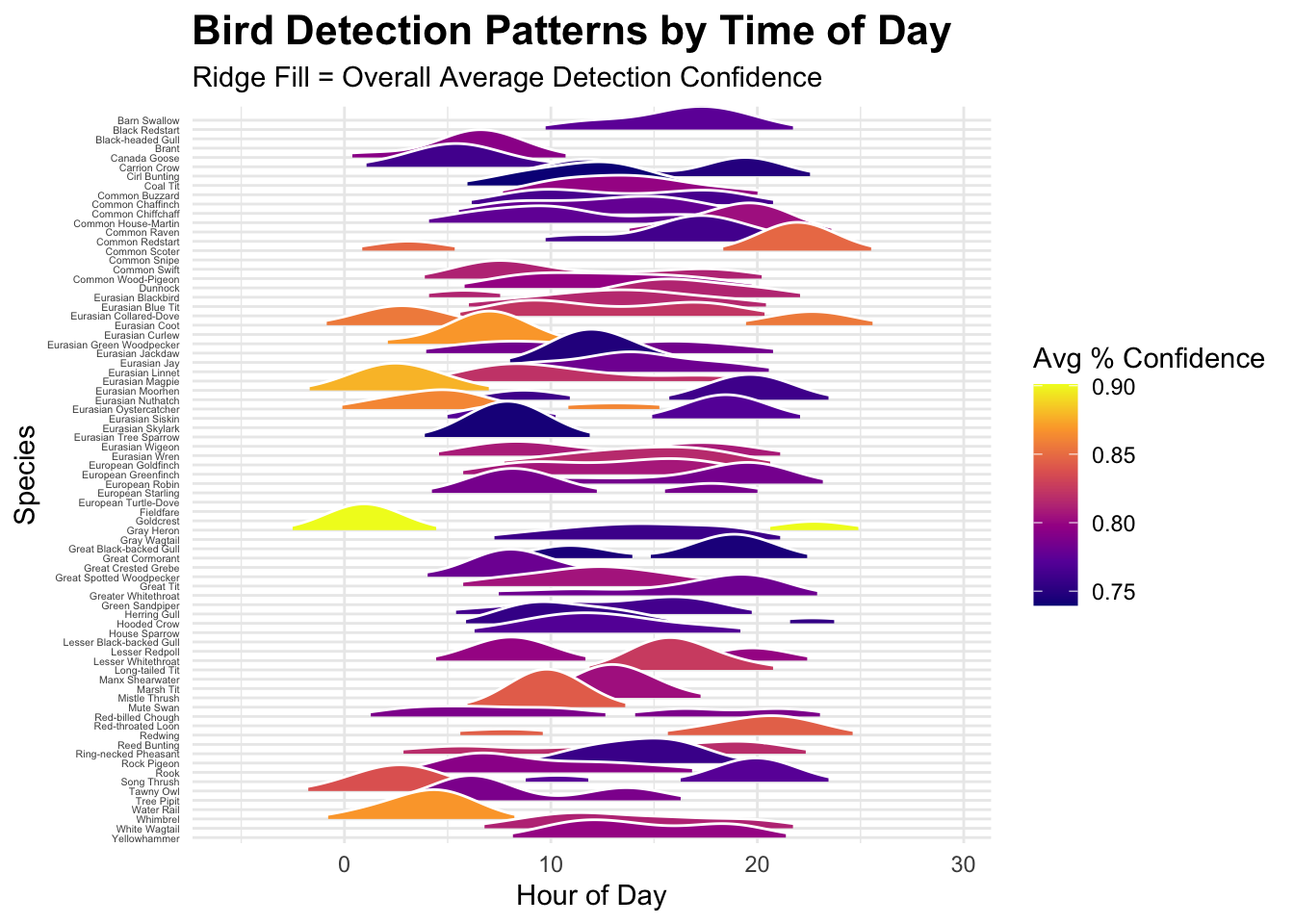
Inspired by listening to Joy Division earlier I thought a ridgeline plot might be the best way to show some of the time of day stuff. Here’s a comparison of when in the day all the different birds have been detected, coloured by the average confidence of the identification of the bird. (not so useful that one but it makes it pretty)…
Show the code
# Load packageslibrary(DBI)library(RSQLite)library(dplyr)library(ggplot2)library(ggridges)library(forcats)library(lubridate)# Connect to the databasecon <-dbConnect(RSQLite::SQLite(), "birds.db")# Read detectionsdetections <-dbGetQuery(con, "SELECT * FROM detections")# Prepare datadetections <- detections %>%mutate(DateTime =as.POSIXct(paste(Date, Time), format ="%Y-%m-%d %H:%M:%S"),Hour =hour(DateTime) +minute(DateTime) /60 )# (Optional) Top 100 speciestop_species <- detections %>%count(Com_Name, sort =TRUE) %>%slice_head(n =100) %>%pull(Com_Name)detections_filtered <- detections %>%filter(Com_Name %in% top_species)# 🛠️ Calculate overall average confidence per speciesspecies_confidence <- detections_filtered %>%group_by(Com_Name) %>%summarise(AvgConfidence =mean(Confidence, na.rm =TRUE), .groups ="drop")# 🛠️ Calculate peak hour for each species (only where n >= 2)species_peak <- detections_filtered %>%group_by(Com_Name) %>%filter(n() >=2) %>%summarise(PeakHour = { dens <-density(Hour, from =0, to =24) dens$x[which.max(dens$y)] },.groups ="drop" )# Join confidence and peak time into main datadetections_final <- detections_filtered %>%left_join(species_confidence, by ="Com_Name") %>%left_join(species_peak, by ="Com_Name") %>%filter(!is.na(PeakHour)) %>%mutate(Com_Name =fct_reorder(Com_Name, PeakHour, .fun = min))# --- RIDGELINE PLOT with Fill and Labels ---ggplot(detections_final, aes(x = Hour, y =fct_rev(Com_Name), fill = AvgConfidence)) +geom_density_ridges(scale =3,rel_min_height =0.1,color ="white",size =0.3,alpha =1 ) +scale_fill_viridis_c(name ="Avg % Confidence", option ="plasma") +theme_minimal(base_family ="sans") +labs(title ="Bird Detection Patterns by Time of Day",subtitle ="Ridges sorted by earliest peak; Fill = Avg Confidence",x ="Hour of Day",y ="Species" ) +theme(plot.background =element_rect(fill ="white", color =NA),panel.background =element_rect(fill ="white", color =NA),axis.text.y =element_text(size =3, color ="black"),axis.text.x =element_text(color ="black"),axis.title =element_text(color ="black"),plot.title =element_text(size =12, face ="bold", color ="black"),plot.subtitle =element_text(size =8, color ="black"),legend.title =element_text(color ="black"),legend.text =element_text(color ="black") )
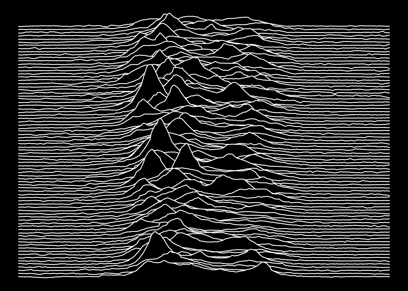
To those of us of a certain age or musical persuassion there’s more than gentle echos of the cover of Joy Division’s Unknown Pleasures (1979). That image, one of the most iconic album artworks ever, is much more minimalist, stark and mysterious.
Interestingly the cover is a plot of successive radio pulses from the first pulsar discovered, CP 1919, superimposed vertically from Radio Observations of the Pulse Profiles and Dispersion Measures of Twelve Pulsars (Craft, 1970).