Walk into any international gathering, and you’ll notice a striking pattern: the color red splashes across flags like a global signature. From the bold crimson of China to the deep scarlet of Turkey, red is a mainstay in vexillology. Apparently the answer lies in a blend of symbolism, practicality, and history, as explored in foundational works on flag design and color history.
Red’s dominance starts with its potent symbolism. Across cultures, red evokes blood, sacrifice, and courage—themes that resonate deeply in national narratives. Whitney Smith, in his 2011 book Flag Lore of All Nations, notes that red often represents the struggles and sacrifices of a nation’s people, whether in war or revolution. China’s flag, for instance, uses red to symbolize its communist revolution, while Turkey’s red echoes the Ottoman Empire’s martial heritage.
Beyond symbolism, red’s prevalence has practical roots. In the days before synthetic dyes, red was one of the easiest colors to produce. Michel Pastoureau, in his 2017 work Red: The History of a Color, explains that natural dyes like madder and cochineal were widely available and affordable, allowing even resource-scarce societies to adorn their banners with red. This accessibility ensured red’s place in early flag-making, from medieval standards to modern national emblems.
History, too, has painted the world’s flags red. Colonial empires, particularly the British, spread their red-heavy designs—like the iconic red ensign—across the globe, influencing the flags of former colonies. Alfred Znamierowski, in his 2009 The World Encyclopedia of Flags, highlights how these imperial legacies shaped the color palettes of nations in Africa, Asia, and the Americas, embedding red in post-colonial identities.
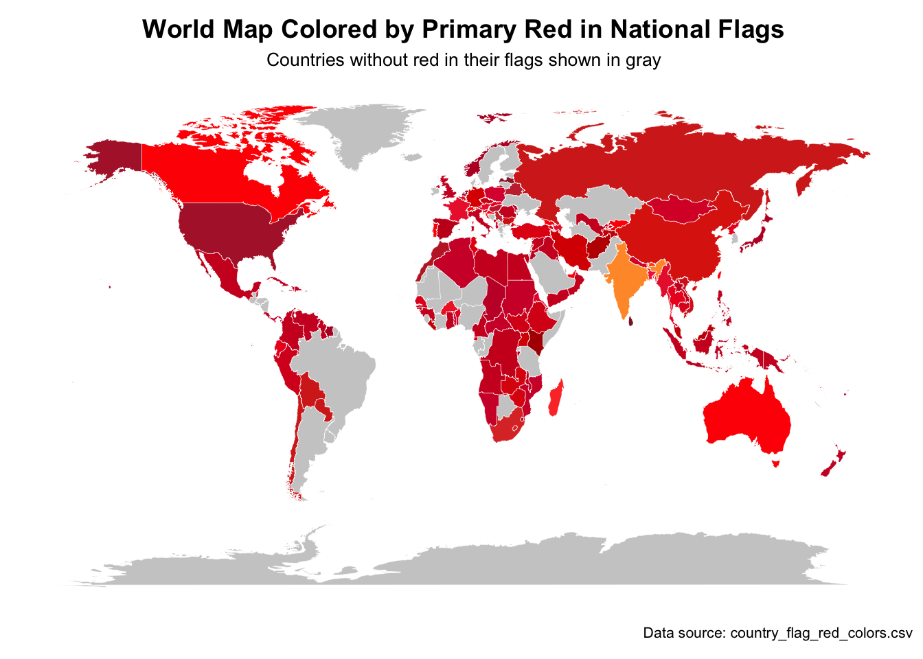
Mapping the Red Flags
To visualize red’s global reach, consider the map below, which colours countries by the shade of red on their national flag;
Show the code
# Load required librarieslibrary(ggplot2)library(dplyr)library(maps)library(readr)library(stringr)library(scales)# Load world map dataworld_map <-map_data("world")# Read the CSV dataflag_data <-read.csv("country_flag_red_colors.csv", stringsAsFactors =FALSE, check.names =FALSE)# Function to manually add missing countries with known red colorsadd_missing_countries <-function(processed_data) {# List of countries with known red colors that might be missing missing_countries <-list("Mexico"=list(hex ="#CE1126", percentage =33.33),"El Salvador"=list(hex ="#0F47AF", percentage =0), # No red, but should be in data"Honduras"=list(hex ="#0073CF", percentage =0), # No red"Nicaragua"=list(hex ="#0067C6", percentage =0), # No red"Guatemala"=list(hex ="#4997D0", percentage =0) # No red )# Check which countries are missing and add themfor (country_name innames(missing_countries)) {if (!country_name %in% processed_data$Country) { color_info <- missing_countries[[country_name]]if (color_info$percentage >0) { # Only add if it has red processed_data <-rbind(processed_data, data.frame(Country = country_name,PrimaryRedHex = color_info$hex,RedPercentage = color_info$percentage,stringsAsFactors =FALSE )) } } }return(processed_data)}# Data preprocessing functionprocess_flag_data <-function(data) {# Create a new dataframe for processed data result <-data.frame(Country =character(),PrimaryRedHex =character(),RedPercentage =numeric(),stringsAsFactors =FALSE )for (i in1:nrow(data)) { country <- data$Country[i]# Remove quotes if present country <-gsub('^"|"$', '', country) red_colors <- data[i, "Red Colors (Hex:Percent)"]# Skip if no red colorsif (is.na(red_colors) || red_colors ==""|| red_colors =='""') {next }# Remove surrounding quotes red_colors <-gsub('^"|"$', '', red_colors)# Split by semicolon to get multiple colors if present color_parts <-strsplit(red_colors, ";")[[1]]# For each color, extract hex and percentage max_percentage <-0 primary_color <-""for (part in color_parts) {# Split by colon to separate hex and percentage hex_pct <-strsplit(part, ":")[[1]]if (length(hex_pct) ==2) { hex <- hex_pct[1]# Handle percentage conversion safely pct_str <- hex_pct[2] percentage <-suppressWarnings(as.numeric(pct_str))# Check if conversion was successfulif (!is.na(percentage)) {# Keep track of the color with highest percentageif (percentage > max_percentage) { max_percentage <- percentage primary_color <- hex } } } }# Add to result if we found a valid colorif (primary_color !="") { result <-rbind(result, data.frame(Country = country,PrimaryRedHex = primary_color,RedPercentage = max_percentage,stringsAsFactors =FALSE )) } }return(result)}# Function to standardize country names for joiningstandardize_names <-function(country_name) {# Handle specific cases that need standardization replacements <-c("United States"="USA","United Kingdom"="UK","Russian Federation"="Russia","Democratic Republic of the Congo"="Democratic Republic of the Congo","Republic of Congo"="Congo","Ivory Coast"="Côte d'Ivoire","São Tomé and Príncipe"="Sao Tome and Principe","North Macedonia"="Macedonia","the Bahamas"="Bahamas","the Gambia"="Gambia","Timor-Leste"="East Timor" )if (country_name %in%names(replacements)) {return(replacements[country_name]) }return(country_name)}# Process the dataprocessed_data <-process_flag_data(flag_data)# Add missing countries with known red colorsprocessed_data <-add_missing_countries(processed_data)# Load world map dataworld_map <-map_data("world")# Standardize country names in processed dataprocessed_data$Country <-sapply(processed_data$Country, standardize_names)# Create a mapping dataframe to match country names in world mapmapping_df <-data.frame(map_country =unique(world_map$region),stringsAsFactors =FALSE)# Merge data for plotting# Create a new dataframe for mergingmerged_data <- world_map# Add color datacountry_colors <-setNames(processed_data$PrimaryRedHex, processed_data$Country)# Function to get color for a country with default for missing valuesget_color <-function(country) {if (country %in%names(country_colors)) {return(country_colors[country]) } else {return("#CCCCCC") # Default gray for countries without red in flag }}# Add color data to map datamerged_data$fill_color <-sapply(merged_data$region, get_color)# Plot the mapp1 <-ggplot() +geom_polygon(data = merged_data, aes(x = long, y = lat, group = group, fill = fill_color),color ="white", size =0.1) +scale_fill_identity() +coord_fixed(1.3) +theme_minimal() +labs(title ="World Map Colored by Primary Red in National Flags",subtitle ="Countries without red in their flags shown in gray",caption ="Data source: country_flag_red_colors.csv") +theme(panel.grid.major =element_blank(),panel.grid.minor =element_blank(),axis.text =element_blank(),axis.title =element_blank(),axis.ticks =element_blank(),plot.title =element_text(size =14, face ="bold", hjust =0.5),plot.subtitle =element_text(size =10, hjust =0.5),plot.caption =element_text(size =8, hjust =1),legend.position ="bottom" )print(p1)