Each die in this experiment represents a radioactive nucleus. On every “roll” (i.e., time step), each die has a fixed probability ( p = ) of decaying (being removed). We begin with 80 dice.
This setup mimics radioactive decay, where: - The probability of a single atom decaying per unit time is constant. - The number of undecayed atoms decreases over time.
# Required librarieslibrary(ggplot2)# ParametersP0 <-80n_rolls <-50p <-1/6# Simulationpop_avg <-numeric(n_rolls +1)set.seed(NULL)P <- P0pop_avg[1] <- P0k <-1while (k <= n_rolls && P >0) { r <-rbinom(1, P, p) P <- P - r pop_avg[k +1] <- P k <- k +1}# Truncate data when population hits zerofinal_index <-which(pop_avg ==0)[1]if (is.na(final_index)) { final_index <-length(pop_avg)}pop_avg <- pop_avg[1:final_index]time <-0:(length(pop_avg) -1)# Exponential decay modellambda <--log(1- p)exp_model <- P0 *exp(-lambda * time)# Geometric approximationgeometric_expansion <-function(t, p, P0, n_terms =15) {sapply(t, function(tt) {sum(sapply(0:(n_terms -1), function(k) { coef <- (-1)^k *choose(tt, k) coef * p^k })) * P0 })}geom_approx <-geometric_expansion(time, p, P0, n_terms =15)# Half-lifet_half <-log(2) / lambda# Combine datadf <-data.frame(Roll = time,Experimental = pop_avg,Exponential = exp_model,Geometric = geom_approx)# Plotggplot(df, aes(x = Roll)) +geom_line(aes(y = Experimental, color ="Experimental (Simulated)")) +geom_line(aes(y = Exponential, color ="Exponential Decay (Continuous)")) +geom_line(aes(y = Geometric, color ="Geometric Expansion (15 terms)"), linetype ="dashed") +geom_vline(xintercept = t_half, linetype ="dotted", color ="purple", linewidth =1) +geom_hline(yintercept = P0 /2, linetype ="dotted", color ="purple") +annotate("text", x = t_half +1, y = P0 /2+3, label ="Half-life", color ="purple") +labs(title ="Radioactive Decay with Half-life Marker",x ="Roll Number", y ="Dice Remaining",color ="Legend" ) +theme_minimal()
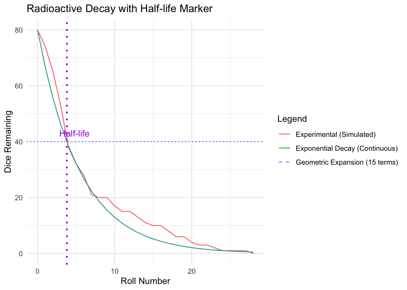
What’s Plotted?
The graph shows three curves:
1. Experimental (Simulated) Line
This line shows the actual number of dice remaining after each roll in a single experiment.
It’s jagged because it’s random: on each roll, a different number of dice decay.
2. Exponential Decay Line (Continuous Model)
This is the smooth curve you’d get if decay happened continuously (instead of once per roll).
It’s based on the exponential decay formula:
[ N(t) = N_0 e^{-t}, = -(1 - p) ]
This is often taught as the theoretical decay law in physics.
🔍 This curve smooths out randomness and assumes infinitesimally small time steps — great for math, but not realistic for real-world random events.
3. Geometric Expansion Line (Dashed)
This is a series approximation of the geometric decay:
[ N(t) = N_0 (1 - p)^t ]
The series is built using the binomial expansion of ( (1 - p)^t ), and you’ve included 15 terms for good accuracy even at early times.
This curve lies right on top of the exponential line for small ( t ), showing they’re nearly equivalent at first.
What the Graph Shows You
Agreement at Early Times: All three lines start at the same place and follow a similar shape, showing how well the continuous exponential model approximates the actual discrete decay early on.
Divergence Through Randomness: The experimental line starts to diverge due to the random nature of decay (especially in single trials).
Geometric vs Exponential: The geometric expansion sits between the raw simulation and the smooth exponential, acting as a bridge between theory and simulation.
Physics Context
This graph is a perfect classroom tool to: - Introduce exponential decay and how it’s derived. - Highlight the assumptions behind the exponential model (e.g., continuous time). - Show how probabilistic events lead to deterministic laws when averaged or modeled. - Provide a critical look at models — the “perfect curve” doesn’t represent any single real-world trial, but rather an average over many.